


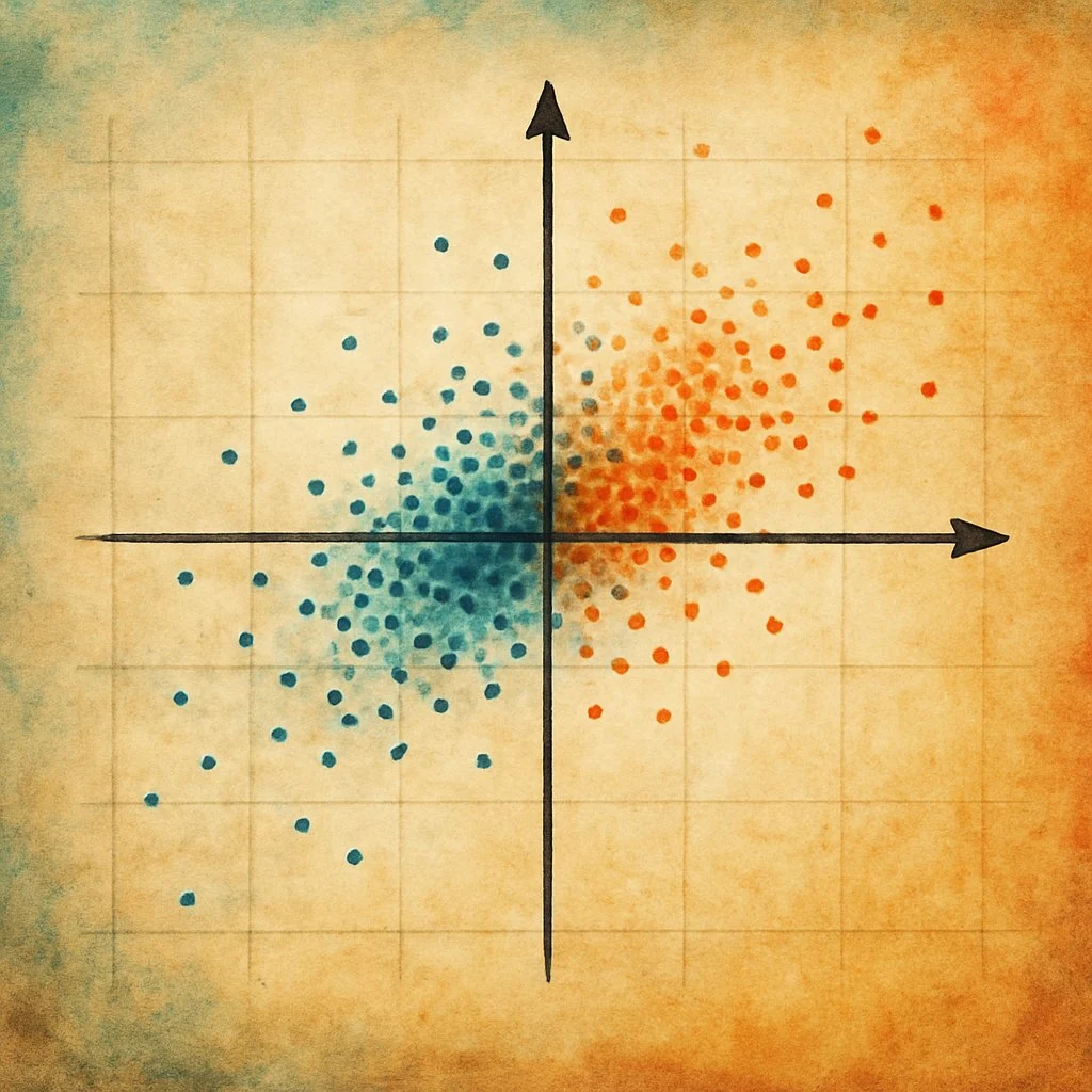
Modern datasets often contain dozens or hundreds of variables, many of them correlated and partly redundant. That makes modeling, visualization and interpretation harder than they need to be. Principal Component Analysis (PCA) cuts the complexity while keeping as much of the variance as it can. Instead of wrestling with a large set of overlapping variables, one can work with a smaller set of dimensions that carry the dominant patterns.
PCA turns the original variables into new ones called principal components. They are uncorrelated, and they arrive ordered by how much variance each explains. The first takes the largest share, the second the next largest, and so on down. Because of that ranking, a handful of components usually carries most of the information. That big picture efficiency is why PCA turns up so often in exploratory analysis, visualization and preprocessing, across numerous domains.
The PCA mechanism
Data preprocessing precedes the decomposition. Each variable is centered by subtracting its sample mean, so that every column has zero mean and the matrix subsequently decomposed is the sample covariance matrix. Centering is an important step of the process, namely, on uncentered data the procedure decomposes the second-moment matrix instead, and the leading direction is drawn toward the centroid, describing where the observations lie as much as how they vary. When variables are recorded in different units or span different orders of magnitude, each centered column is further divided by its sample standard deviation, which renders the analysis equivalent to an eigendecomposition of the correlation matrix and allows values, counts, and proportions to contribute on comparable terms. Standardization assigns equal prior weight to every variable and therefore amplifies those whose variance is small and largely noise, it is appropriate when units are arbitrary or incommensurable, whereas the original scale should be retained when variables share a unit and their relative variances are themselves informative. Where the components feed a predictive model, the means and standard deviations must be estimated on the training partition alone and applied unchanged to held-out data, so that no information leaks across the split.
The decomposition then seeks the directions in feature space along which the projected observations vary most. The first loading vector is the unit-length vector that maximizes the variance of the projections. Each subsequent loading vector maximizes the residual variance subject to orthogonality with those already extracted, which renders the resulting component scores mutually uncorrelated. These loading vectors are the eigenvectors of the covariance matrix, and the corresponding eigenvalues are the variances of the associated components. Because the eigenvalues are non-negative and sum to the total variance, the proportion of variance attributable to each component follows directly. Practically, the loadings are usually computed as the right singular vectors of the preprocessed data matrix, which is numerically more stable than forming the covariance matrix first.
Two properties of the method warrant emphasis. First, it is linear. Components are linear combinations of the measured variables, and the retained subspace is optimal only within that class. No linear subspace of equal dimension reconstructs the data with smaller squared error, but curvature and dependence beyond second order are invisible to the criterion. Second, variance is not synonymous with relevance. Directions of small variance may carry the structure of interest, class separation in particular, and because the sample covariance is not robust, a few extreme observations can dominate the leading components.
Figure 1 illustrates the criterion in a two-variable example. As a candidate direction is rotated through the half-circle of distinct orientations, the variance of the projections traces a smooth sinusoidal profile with a single maximum and a single minimum. The orientation at the maximum defines the first principal component, and the perpendicular orientation, at the minimum, defines the second. The profile repeats over a full rotation, since a direction and its reverse span the same axis and the sign of each loading vector is therefore arbitrary. The maximum is unique only when the two eigenvalues differ, in the isotropic case the profile is flat and the axes are not identified.
Figure 1 · Principal Component Analysis
Finding the direction of greatest variance
Two exam scores that rise together form a tilted cloud. Rotate the candidate direction and watch how much of the total variance the projected scores capture. The maximum occurs at the first principal component.
Forty students are plotted by standardized Math score on the horizontal axis and standardized Physics score on the vertical axis. The scores are positively correlated, so the cloud tilts along a 45-degree diagonal. Projecting the points onto that diagonal captures 90 percent of the total variance, the largest share of any direction. That diagonal is the first principal component, the top eigenvector of the covariance matrix. A perpendicular direction captures the remaining 10 percent and is the second principal component.
This direction captures 50% of the total variance. Rotate toward PC₁ (the dashed blue axis) to reach the maximum.
Direction weights: w₁ = 1.00 (Math), w₂ = 0.00 (Physics)
Standardized: each feature has equal spread (variance 1).
The first component is the direction that preserves the most variance, so keeping only that component compresses the data to a single dimension. Figure 2 shows what that compression costs. Projecting every observation onto one line rebuilds each point from its score along the line, and the leftover perpendicular distances, once squared and averaged, equal the variance that is discarded.
Figure 2 · Principal Component Analysis
Projection, reduction, and reconstruction
Reducing the two features to a single component replaces each point with its projection onto one line. Rotate the line to see how the reconstruction error grows, and why the first principal component is the best one-dimensional summary.
The same forty standardized observations are projected onto a single line to reduce them from two dimensions to one. Each point keeps only its coordinate along the line, and the squared perpendicular distances to the line, averaged over the points, are the variance that is discarded. When the line is the first principal component, the projection keeps 90 percent of the variance and the squared reconstruction error is the smallest possible for any single direction. Rotating the line away from the first principal component keeps less variance and increases the reconstruction error. The kept variance and the reconstruction error always add up to the total variance of 2, because the two standardized features each contribute a variance of 1.
Projecting onto PC₁ keeps 1.80 of the 2.00 total variance and leaves the smallest possible reconstruction error, 0.20.
Showing the original 2D points with their projections onto the line.
Because the first principal component makes those perpendicular distances as small as possible, it gives the most faithful one-dimensional summary the data allows. Projecting onto a component keeps a blend of every feature, which differs from deleting a raw feature and losing the information it carried.
Once the components are computed, they are ranked by explained variance. One common approach keeps enough components to explain a fixed proportion of total variance, say 90 or 95 percent. Another reads a scree plot for the elbow where marginal gains diminish. You can then feed the reduced representation into clustering, classification, visualization, or noise reduction, provided the discarded components carry little signal. Both computational efficiency and model stability often improve. Figure 3 turns this ranking into a scree view, where the individual explained-variance ratios and their cumulative sum show how many components a chosen threshold requires.
Figure 3 · Principal Component Analysis
Explained variance and choosing components
Each component explains a share of the total variance, and the shares shrink in order. Choose how many components to keep and see how much variance you retain. Where you draw the line is a modeling choice.
An illustrative example with five standardized features. The individual explained-variance ratios are 58, 22, 10, 6, and 4 percent for components one through five. Their cumulative sum reaches 58, 80, 90, 96, and 100 percent. The biggest single drop is from the first to the second component, and the curve then flattens after the second component, forming a natural elbow. Keeping two components retains 80 percent of the variance, three components retain 90 percent, and four retain 96 percent. A variance threshold such as 90 percent is one common rule, and predictive value is measured against the downstream target.
Keeping 2 of 5 components retains 80% of the total variance and discards 20%. The bars are individual explained-variance ratios. The amber line is their running (cumulative) sum.
Treat a threshold such as 90 percent as a guideline you are free to argue with. The variance a component explains does not by itself measure its predictive value or its practical usefulness.
Interpreting components and loadings
Reduced components become useful once you can understand what they represent. Interpretation is driven by factor loadings, which quantify how strongly each original variable contributes to each component. In this article those values are the unscaled eigenvector weights taken straight from the component matrix, so read them for relative magnitude within a component. They are easy to confuse with the correlation between a variable and a component, which is a different quantity. Large positive or negative loadings indicate that a variable is closely aligned with a component, while values near zero imply weak influence.
Inspecting these loadings reveals meaningful structure in the abstract components. A component dominated by variables such as income, education level, and occupational status can often be interpreted as a socioeconomic dimension. This interpretability turns PCA from a mathematical transformation into a practical big-picture overview.
Loadings also guide feature engineering and selection:
- Variables with consistently low contributions across the major components add little to the dominant variance directions.
- Variables with similar loading patterns often move together, which points to redundancy and opportunities for simplification with little information loss.
- In applied workflows, new observations are centered, and scaled when the features were standardized, using the training statistics rather than their own. They are then projected into the same component space, which supports consistent scoring, clustering, and model inputs across datasets.
Practical takeaways
A few principles keep PCA reliable in applied work:
- ✓Treat PCA as both a statistical method and a modeling tool.
- ✓Preprocess with care. Center the data, and scale features when they are measured on different scales.
- ✓Balance interpretability against information retention when deciding how many components to keep, rather than relying on variance thresholds alone.
- ✓Read the loadings. They expose latent structure and guide better feature design.
Example: PCA on country indicators
PrincipalComponents
How Principal Component Analysis turns nine correlated country indicators into three interpretable dimensions. The data are standardized, projected, visualized & explained.
Principal Components. How Principal Component Analysis turns nine correlated country indicators into three interpretable dimensions. The data are standardized, projected, visualized & explained. Key topics covered: Country indicator data, Standardize and scale, 2D scatter projections, Three-component embedding, Variance explained, Factor loadings, Interactive 3D view, Factor loading analysis.
This notebook builds a compact, visual summary of how countries relate to one another across a small set of socio-economic and health indicators.
This notebook produces:
- A 3-component PCA embedding (PC1–PC3) for each country
- 2D and 3D scatter plots colored by continent (with hover details)
- A variance summary to understand how much structure is captured in the first few axes
- A factor loadings view to see which original variables most strongly align with each axis
Data
The dataset contains country-level socioeconomic and health indicators designed to reflect overall national development conditions. Someone assembled the dataset to simulate how an international NGO might prioritize aid, identifying the countries in greatest need from measurable structural factors. It is therefore an educational, analysis-ready dataset rather than primary data collected directly by the NGO. Further information about the dataset can be found by accessing the link: https://www.kaggle.com/datasets/vipulgohel/clustering-pca-assignment/data
Import dependencies
This section sets up the minimal toolkit for the workflow:
- pandas / numpy for data handling
- scikit-learn for the PCA transform and feature scaling
- plotly for interactive plots (hover, zoom, rotate)
Keeping plotting interactive matters here because country labels can easily clutter static figures.
import numpy as np
import pandas as pd
from sklearn.decomposition import PCA
from sklearn.preprocessing import StandardScaler
import plotly.express as px
import plotly.graph_objects as goRead data and choose the PCA feature set
The analysis uses Country-data.csv. Two practical expectations:
- The file includes a
countrycolumn for labels and acontinentcolumn for coloring. - The variables listed in
featuresare numeric and measured at the country level.
# Import Country-data.csv without creating index column
def import_data(file_path):
    try:
        df = pd.read_csv(file_path, index_col=False)
        return df
    except Exception as e:
        print(f"An error occurred while importing the data: {e}")
        return None

# Load data
file_path = "Country-data.csv"
data_df = import_data(file_path)

# Select numerical columns for PCA
features = ['child_mort', 'exports', 'health', 'imports', 'income',
            'inflation', 'life_expec', 'total_fer', 'gdpp']

X = data_df[features]

# Define a custom color map
continent_color_map = {
    'Asia': 'red',
    'Europe': 'blue',
    'Africa': 'green',
    'North America': 'purple',
    'South America': 'orange',
    'Oceania': 'brown',
    'Antarctica': 'cyan'
}Fit PCA and prepare outputs for interpretation
This step produces two things:
- A coordinate for each country in a 3D PCA space (
PC1,PC2,PC3) - A loadings matrix that links each PCA axis back to the original features
A few interpretation notes that prevent common confusion:
- The sign of any PC axis is arbitrary. If an axis flips direction, the geometry is unchanged.
- The PCA coordinates are most useful comparatively (country A vs country B, region clusters, gradients). On its own, a single score carries no inherent unit.
- Loadings are easiest to read in terms of relative magnitude within a component, that is, which variables move together along that axis.
The notebook also rounds PCA coordinates for hover display so the plots stay readable.
# Standardize the data
scaler = StandardScaler()
X_scaled = scaler.fit_transform(X)

# Perform PCA
pca = PCA(n_components=3)
X_pca = pca.fit_transform(X_scaled)

# Extract loadings directly
loadings = pca.components_.T  # Shape: (features, components)

# Create DataFrame for plotting
pca_df = pd.DataFrame(X_pca, columns=['PC1', 'PC2', 'PC3'])
pca_df['Country'] = data_df['country']
pca_df['Continent'] = data_df['continent']  # Add Continent column

# Round PCA values for hover display
pca_df_hover = pca_df.copy()
pca_df_hover['PC1'] = pca_df_hover['PC1'].round(4)
pca_df_hover['PC2'] = pca_df_hover['PC2'].round(4)
pca_df_hover['PC3'] = pca_df_hover['PC3'].round(4)About the PCA dataframe used for plotting
pca_df contains the PCA coordinates plus human-readable labels. All plots in the next sections are built from pca_df_hover, which simply rounds the numeric coordinates for cleaner hover tooltips.
If labels are missing or mis-capitalized in the CSV (for example Country vs country), update the column names here to avoid silent plotting issues.
Two-dimensional PCA views
The 2D plots are usually the fastest way to build intuition.
What to look for:
- Separation by continent (or lack of it): do regions overlap heavily or form distinct clouds?
- Gradients across the plane: do labels suggest a smooth progression rather than discrete groups?
- Outliers: countries that sit far from their neighbors can be interesting, or they can signal data quality issues. They also shape the axes themselves, because PCA maximizes a squared quantity, so a few extreme countries can pull a component toward them.
Practical tip: country text labels can overlap. Use zoom and hover to inspect crowded areas.
# 2D Plot: PC1 vs PC2
fig_2d_pc1_pc2 = px.scatter(
    pca_df_hover,
    x='PC1',
    y='PC2',
    color='Continent',
    color_discrete_map=continent_color_map,
    text='Country',
    title='',
    labels={'PC1': 'PC1', 'PC2': 'PC2'},
    opacity=0.7,
    hover_data={'PC1': ':.4f', 'PC2': ':.4f', 'PC3': ':.4f', 'Country': True, 'Continent': True}
)

fig_2d_pc1_pc2.update_traces(
    marker=dict(size=6, symbol='circle'),
    textposition='top center',
    textfont=dict(color='black')  # Country labels black
)

fig_2d_pc1_pc2.update_layout(
    xaxis=dict(
        title=dict(text='<b>PC 1</b>', font=dict(color='black')),
        tickfont=dict(color='black')
    ),
    yaxis=dict(
        title=dict(text='<b>PC 2</b>', font=dict(color='black')),
        tickfont=dict(color='black')
    ),
    legend=dict(
        title=dict(text='Continent', font=dict(color='black')),
        font=dict(color='black')  # Legend items black
    ),
    margin=dict(l=0, r=0, b=0, t=50),
    width=900,
    height=900,
    title_x=0.5
)

fig_2d_pc1_pc2.write_html("pca_2d_pc1_vs_pc2.html")
fig_2d_pc1_pc2.show()

# 2D Plot: PC1 vs PC3
fig_2d_pc1_pc3 = px.scatter(
    pca_df_hover,
    x='PC1',
    y='PC3',
    color='Continent',
    color_discrete_map=continent_color_map,
    text='Country',
    title='',
    labels={'PC1': 'PC1', 'PC3': 'PC3'},
    opacity=0.7,
    hover_data={'PC1': ':.4f', 'PC2': ':.4f', 'PC3': ':.4f', 'Country': True, 'Continent': True}
)

fig_2d_pc1_pc3.update_traces(
    marker=dict(size=6, symbol='circle'),
    textposition='top center',
    textfont=dict(color='black')
)

fig_2d_pc1_pc3.update_layout(
    xaxis=dict(
        title=dict(text='<b>PC 1</b>', font=dict(color='black')),
        tickfont=dict(color='black')
    ),
    yaxis=dict(
        title=dict(text='<b>PC 3</b>', font=dict(color='black')),
        tickfont=dict(color='black')
    ),
    legend=dict(
        title=dict(text='Continent', font=dict(color='black')),
        font=dict(color='black')
    ),
    margin=dict(l=0, r=0, b=0, t=50),
    width=900,
    height=900,
    title_x=0.5
)

fig_2d_pc1_pc3.write_html("pca_2d_pc1_vs_pc3.html")
fig_2d_pc1_pc3.show()

# 2D Plot: PC2 vs PC3
fig_2d_pc2_pc3 = px.scatter(
    pca_df_hover,
    x='PC2',
    y='PC3',
    color='Continent',
    color_discrete_map=continent_color_map,
    text='Country',
    title='',
    labels={'PC2': 'PC2', 'PC3': 'PC3'},
    opacity=0.7,
    hover_data={'PC1': ':.4f', 'PC2': ':.4f', 'PC3': ':.4f', 'Country': True, 'Continent': True}
)

fig_2d_pc2_pc3.update_traces(
    marker=dict(size=6, symbol='circle'),
    textposition='top center',
    textfont=dict(color='black')
)

fig_2d_pc2_pc3.update_layout(
    xaxis=dict(
        title=dict(text='<b>PC 2</b>', font=dict(color='black')),
        tickfont=dict(color='black')
    ),
    yaxis=dict(
        title=dict(text='<b>PC 3</b>', font=dict(color='black')),
        tickfont=dict(color='black')
    ),
    legend=dict(
        title=dict(text='Continent', font=dict(color='black')),
        font=dict(color='black')
    ),
    margin=dict(l=0, r=0, b=0, t=50),
    width=900,
    height=900,
    title_x=0.5
)

fig_2d_pc2_pc3.write_html("pca_2d_pc2_vs_pc3.html")
fig_2d_pc2_pc3.show()Countries in the PC1 and PC2 plane
Countries in the PC1 and PC3 plane
Countries in the PC2 and PC3 plane
Three-dimensional PCA view
The 3D view is mainly a diagnostic and storytelling aid:
- It helps when structure is not obvious in any single 2D projection.
- Rotating the plot can reveal “layers” that are hidden when only PC1–PC2 is shown.
If the 3D plot looks like a thin sheet, most of the visual structure is already captured by two axes.
# 3D Plot: PC1 vs PC2 vs PC3
fig_3d = px.scatter_3d(
    pca_df_hover,
    x='PC1',
    y='PC2',
    z='PC3',
    color='Continent',
    color_discrete_map=continent_color_map,
    text='Country',
    title='',
    labels={'PC1': 'PC1', 'PC2': 'PC2', 'PC3': 'PC3'},
    opacity=0.7,
    hover_data={'PC1': ':.4f', 'PC2': ':.4f', 'PC3': ':.4f', 'Country': True, 'Continent': True}
)

fig_3d.update_traces(
    marker=dict(size=3),
    textposition='top center',
    textfont=dict(color='black')
)

fig_3d.update_layout(
    scene=dict(
        xaxis=dict(
            title=dict(text='<b>PC 1</b>', font=dict(color='black')),
            tickfont=dict(color='black')
        ),
        yaxis=dict(
            title=dict(text='<b>PC 2</b>', font=dict(color='black')),
            tickfont=dict(color='black')
        ),
        zaxis=dict(
            title=dict(text='<b>PC 3</b>', font=dict(color='black')),
            tickfont=dict(color='black')
        )
    ),
    legend=dict(
        title=dict(text='Continent', font=dict(color='black')),
        font=dict(color='black')
    ),
    margin=dict(l=0, r=0, b=0, t=50),
    width=900,
    height=800,
    title_x=0.5
)

fig_3d.write_html("pca_3d.html")

fig_3d.show()Rotatable three-component country embedding
The component scores show wide dispersion across countries, especially along PC1, which by construction carries the largest spread and so marks the direction along which these countries differ most. PC2 and PC3 introduce additional but smaller layers of variation, further separating countries that are closer along PC1 but differ in trade-related or macroeconomic patterns.
Variance summary by component
This bar plot provides a compact check on whether three components are “enough” for the intended use.
How to use it in practice:
- If the first bar is dominant, the embedding may behave like a near-1D ranking.
- If the first few bars are similar, the structure is more distributed and multiple views matter.
- If three components capture only a small share, consider increasing
n_componentsor revisiting feature engineering.
This notebook keeps n_components=3 to support 3D visualization and easy interpretation.
# Variance Explained Bar Plot
explained_variance_ratio = pca.explained_variance_ratio_

fig_variance_explained = px.bar(
    x=[f'PC{i+1}' for i in range(len(explained_variance_ratio))],
    y=explained_variance_ratio,
    labels={'x': '<b>Principal Component</b>', 'y': '<b>Variance Explained</b>'},
    title='<b>Variance Explained by Principal Components</b>',
    text=[f"{v:.1%}" for v in explained_variance_ratio]
)

fig_variance_explained.update_traces(
    marker_color='skyblue',
    textposition='outside',
    textfont=dict(color='black'),
    hovertemplate='<b>%{x}</b><br>Variance Explained: %{y:.1%}<extra></extra>'
)

fig_variance_explained.update_layout(
    yaxis_tickformat='.0%',
    yaxis=dict(
        range=[0, 1],
        tickfont=dict(color='black'),
        title=dict(text='<b>Variance Explained</b>', font=dict(color='black'))
    ),
    xaxis=dict(
        tickfont=dict(color='black'),
        title=dict(text='<b>Principal Component</b>', font=dict(color='black'))
    ),
    title=dict(
        text='<b>Variance Explained by Principal Components</b>',
        font=dict(color='black')
    ),
    title_x=0.5,
    margin=dict(l=0, r=0, b=0, t=50),
    width=800,
    height=600
)

fig_variance_explained.write_html("variance_explained_nt.html")

fig_variance_explained.show()Share of variance captured per component
Factor loadings table
The loadings table is where the PCA result becomes explainable.
Reading the table:
- Large absolute values in a column indicate variables that align strongly with that axis.
- Mixed signs often indicate “trade-offs” along the axis (variables pushing in opposite directions).
- Variables with consistently small values across PCs may be less informative for this specific embedding.
This is also a useful place to check for surprises. For example, if a variable dominates every component, it may be acting as a proxy for scale or data quirks rather than a meaningful signal.
# Factor Loadings Table
factor_loadings = pd.DataFrame(loadings, index=features, columns=['PC1', 'PC2', 'PC3'])
factor_loadingsFactor loadings for the first three components
| PC1 | PC2 | PC3 | |
|---|---|---|---|
| child_mort | -0.420 | 0.193 | -0.030 |
| exports | 0.284 | 0.613 | 0.145 |
| health | 0.151 | -0.243 | -0.597 |
| imports | 0.161 | 0.672 | -0.300 |
| income | 0.398 | 0.023 | 0.302 |
| inflation | -0.193 | -0.008 | 0.643 |
| life_expec | 0.426 | -0.223 | 0.114 |
| total_fer | -0.404 | 0.155 | 0.020 |
| gdpp | 0.393 | -0.046 | 0.123 |
Trivariate loadings plot
This plot treats each feature as a line from the origin out to a diamond marker at its PC1, PC2 and PC3 weights (rather than each country).
Why this is helpful:
- Features that land close to each other tend to move in the same direction within the embedding.
- Features that sit on opposite sides of the origin often represent contrasting patterns.
- Features near the origin contribute weakly to the first three PCs (in this specific setup).
The interactive hover is especially useful here because multiple variables can cluster together.
# Prepare Loadings DataFrame for Plotting
loadings_df = factor_loadings.reset_index()
loadings_df.rename(columns={'index': 'Feature'}, inplace=True)

# Round loadings to 4 decimals for hover display
loadings_df_hover = loadings_df.copy()
loadings_df_hover['PC1'] = loadings_df_hover['PC1'].round(4)
loadings_df_hover['PC2'] = loadings_df_hover['PC2'].round(4)
loadings_df_hover['PC3'] = loadings_df_hover['PC3'].round(4)

# Compute axis limits with padding
padding = 0.1  # Adjust if necessary
x_min, x_max = loadings_df_hover['PC1'].min(), loadings_df_hover['PC1'].max()
y_min, y_max = loadings_df_hover['PC2'].min(), loadings_df_hover['PC2'].max()
z_min, z_max = loadings_df_hover['PC3'].min(), loadings_df_hover['PC3'].max()

x_range = [x_min - padding, x_max + padding]
y_range = [y_min - padding, y_max + padding]
z_range = [z_min - padding, z_max + padding]

# 3D Loadings Plot: PC1 vs PC2 vs PC3 with proper hover info
fig_loadings_3d = go.Figure()

# Add lines and points with detailed hover text
for i in range(len(loadings_df_hover)):
    fig_loadings_3d.add_trace(go.Scatter3d(
        x=[0, loadings_df_hover.loc[i, 'PC1']],
        y=[0, loadings_df_hover.loc[i, 'PC2']],
        z=[0, loadings_df_hover.loc[i, 'PC3']],
        mode='lines+markers+text',
        marker=dict(size=6, symbol='diamond'),
        line=dict(width=3),
        text=[None, loadings_df_hover.loc[i, 'Feature']],
        textposition='top center',
        textfont=dict(color='black', size=12),
        hoverinfo='text',
        hovertext=[
            '',
            f"<b>Feature:</b> {loadings_df_hover.loc[i, 'Feature']}<br>"
            f"<b>PC1:</b> {loadings_df_hover.loc[i, 'PC1']:.4f}<br>"
            f"<b>PC2:</b> {loadings_df_hover.loc[i, 'PC2']:.4f}<br>"
            f"<b>PC3:</b> {loadings_df_hover.loc[i, 'PC3']:.4f}"
        ],
        showlegend=False
    ))

# Update layout
fig_loadings_3d.update_layout(
    scene=dict(
        xaxis=dict(
            title=dict(text='<b>PC 1</b>', font=dict(color='black')),
            tickfont=dict(color='black'),
            range=x_range,
            zeroline=True,
            zerolinewidth=2,
            zerolinecolor='black'
        ),
        yaxis=dict(
            title=dict(text='<b>PC 2</b>', font=dict(color='black')),
            tickfont=dict(color='black'),
            range=y_range,
            zeroline=True,
            zerolinewidth=2,
            zerolinecolor='black'
        ),
        zaxis=dict(
            title=dict(text='<b>PC 3</b>', font=dict(color='black')),
            tickfont=dict(color='black'),
            range=z_range,
            zeroline=True,
            zerolinewidth=2,
            zerolinecolor='black'
        )
    ),
    margin=dict(l=0, r=0, b=0, t=50),
    width=900,
    height=800,
    title_x=0.5,
    scene_aspectmode='cube',  # Ensures equal aspect ratio
)

# Save the figure as HTML
fig_loadings_3d.write_html("pca_loadings_3d.html")

# Show the figure
fig_loadings_3d.show()
Features drawn in loading space
PC1 contrasts development-related indicators. Income, GDP per capita, and life expectancy carry one sign while child mortality and fertility carry the opposite. Since the sign of an axis is arbitrary, what suggests a broad socioeconomic development gradient is the opposition itself, whichever way it happens to point. PC2 is dominated by trade openness, with imports and exports, both recorded as shares of GDP, carrying the largest loadings and the same sign, indicating engagement with trade relative to the size of the economy. Absolute volume is a separate matter. The United States, which trades heavily, sits at the far end of this axis from small open economies such as Singapore and Luxembourg. PC3 is driven mainly by inflation set against health spending as a share of GDP, the two carrying opposite signs, reflecting a macroeconomic stability versus social investment pattern. Together, the components separate countries by development level, trade openness, and economic stability. Those three labels are a reading of the loadings, arrived at by eye.
Wrap-up
At this point there are three complementary views of the same data:
- Country locations in PC space (2D and 3D plots)
- How much information each PC contributes (variance bars)
- Which raw variables are most aligned with each axis (loadings table and loadings scatter)
Key Takeaways
When variables differ in scale, the one with the largest raw spread pulls PC₁ toward itself. Figure 1’s toggle shows this directly. Standardized, each feature contributes a variance of 1, so no feature dominates on scale alone.
Each component is a weighted combination of every original variable, so projecting keeps a blend of all of them and drops no columns. That is why a two-component view can still carry information from nine indicators.
Figure 2 makes the identity visible. Projecting the observations onto PC₁ keeps 1.80 of the 2.00 total variance and discards 0.20 as reconstruction error. No other single direction leaves a smaller error.
Figure 3’s ratios of 58, 22, 10, 6, and 4 percent reach 80 percent at two components and 90 percent at three, with an elbow after PC₂. A threshold tells you how much spread you kept. Whether the reduced data works has to be checked some other way.
Each component is a linear combination of the inputs, so PCA only finds structure that lies along straight directions in the feature space. An embedding with no visible structure tells you about those straight directions only. Curved structure can sit underneath it, untouched.
Read relative magnitudes within a component, and treat the sign of an axis as arbitrary. Imports at 0.672 and exports at 0.613 dominate the country example’s PC2, which reads as trade openness, with imports and exports recorded as shares of GDP. That name is something you bring to the numbers; PCA returns only the weights.
Data & License
Country-level socio-economic and health indicators for 167 countries (the “HELP International” data), published on Kaggle by Vipul Gohel. Source: kaggle.com/datasets/vipulgohel/clustering-pca-assignment.License: CC0 1.0 Universal (Public Domain Dedication) — no rights reserved; attribution is not legally required and is given here as a courtesy. CC0 1.0
© 2025 Philip Sarajlic. All rights reserved for the article’s original text and figures; the third-party data remains under the license shown above.
Code examples in this article are licensed under the Common Public Attribution License Version 1.0 (CPAL-1.0), an OSI-approved copyleft license based on the Mozilla Public License 1.1. Initial Developer: Philip Sarajlic.
Attribution required by CPAL Exhibit B: © 2025 Philip Sarajlic · “Based on code by Philip Sarajlic” · philipsarajlic.com · no graphic image. This attribution must be displayed in Larger Works.
Modifications must be released in Source Code form under CPAL-1.0. Making the code usable by anyone other than you over a network is External Deployment under the license and is treated as distribution, so the Source Code must be made available to those users.
Full text: opensource.org/license/cpal-1-0 (SPDX identifier CPAL-1.0)

